Logo, Color, and Typography – The 3 Core Elements of Good Packaging Design
Introduction
Every great product begins with a great package — and every great package is built on three timeless design pillars: logo, color, and typography design.
These three visual elements decide whether your product stands out on the shelf or disappears in the crowd. Together, they create a brand’s first impression, emotional connection, and recognition.
If you’re a startup or small business owner designing packaging for the first time, understanding how to balance these three elements can transform your brand’s identity and sales performance.
Let’s explore how Logo, Color, and Typography form the foundation of effective packaging design.
In this guide, you’ll learn how logo, color, and typography design shape great packaging and make your brand stand out.
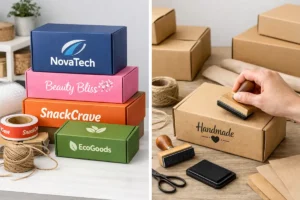
1. Logo Design in Packaging – Your Brand’s Identity
Your logo is the visual cornerstone of your packaging. It tells customers who you are — instantly.
✅ Why the Logo Matters
-
Builds brand recall (think Apple or Amul).
-
Adds professionalism and trust.
-
Helps your product look consistent across SKUs.
💡 Logo Design Tips for Packaging
-
Use vector format (.AI or .SVG) for sharp printing.
-
Keep it simple and scalable – it should look great on both a pouch and a label.
-
Avoid overcrowding – give the logo breathing space.
-
Use a consistent placement (top-center or top-left) across all designs.
🧠 Pro Tip: Use PackagingSeller.com templates that include smart logo placement zones — ensuring balance and hierarchy in your design.
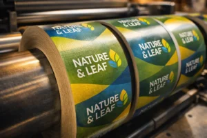
2. Color Psychology in Packaging Design
Color is the fastest communicator in packaging design — it sets emotion, tone, and even buying behavior within seconds.
✅ Why Color Is Crucial
-
Influences perception and emotion.
-
Helps in brand differentiation (for example, red for energy, blue for trust, green for natural products).
-
Boosts shelf visibility and recall.
🎨 Choosing the Right Color Palette
| Brand Type | Ideal Colors | Emotion Triggered |
|---|---|---|
| Health & Wellness | Green, White, Soft Beige | Calm, Natural, Safe |
| Beauty & Skincare | Pastel Pink, Lavender, Gold | Feminine, Luxury |
| Food & Beverage | Red, Yellow, Orange | Appetite, Energy |
| Tech & Modern | Black, Silver, Blue | Confidence, Innovation |
💡 Pro Tip: Use two primary colors and one accent color for balance.
Overuse of too many colors can dilute brand focus.
🧩 PackagingSeller templates come with ready color palettes that can be customized according to your brand theme.
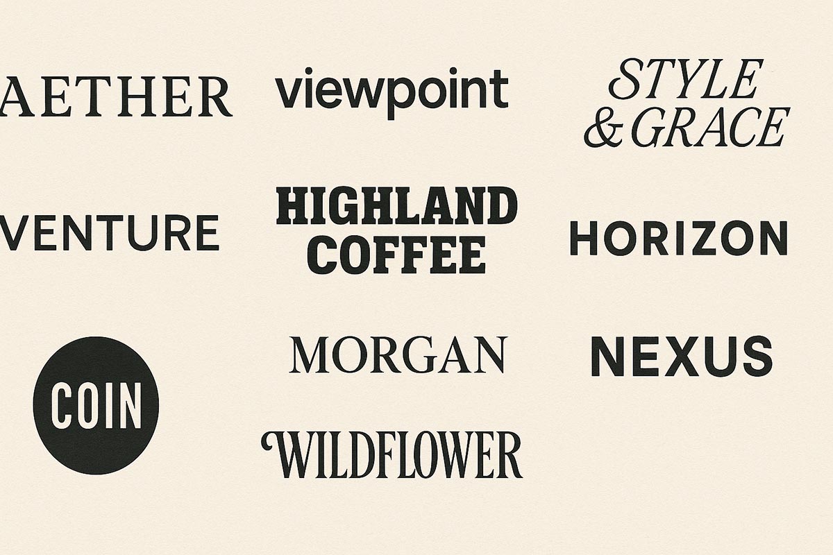
3. Typography Design for Packaging Labels
Typography doesn’t just show your product’s name — it expresses your brand’s personality and tone.
✅ Why Typography Matters
-
Improves readability and hierarchy.
-
Defines the mood (playful, bold, minimal, or elegant).
-
Enhances shelf visibility and brand recognition.
✍️ Typography Tips for Packaging
-
Use 1–2 font families maximum.
-
Pair Sans-serif (modern) with Serif (classic) for balance.
-
Maintain font hierarchy:
-
Product name → bold & large
-
Benefits → medium size
-
Ingredients & directions → smaller and clean
-
-
Always check legibility on actual printed size.
💡 Pro Tip: Try font styles like Montserrat, Poppins, or Lora for clean, modern packaging designs.
Good logo color typography design ensures every element aligns with brand emotion and visibility.
How Logo, Color & Typography Design Work Together
When combined thoughtfully, logo, color, and typography create a unified packaging system that builds trust, emotion, and memory.
-
A recognizable logo builds identity.
-
A harmonized color palette creates emotional connection.
-
Consistent typography maintains brand clarity.
🎯 Together, they help your product tell a story before the customer even opens it.
Bonus: Test Before You Print
Before finalizing your packaging design:
-
Print a mockup on A4 to check alignment and readability.
-
Test under different lighting conditions (store vs natural light).
-
Take feedback from a few target customers — small tweaks can improve appeal.
Why Use PackagingSeller.com for Design Templates
At PackagingSeller.com, you’ll find hundreds of ready-to-edit packaging templates designed with these three core elements already optimized:
-
Perfect logo positioning zones
-
Balanced color schemes
-
Pre-tested typographic hierarchy
You can easily edit them in Adobe Illustrator, replace content, and export print-ready files — saving you design time and cost.
✨ Start with a template, make it yours, and launch like a pro.
Must-Have Design Tools
- Digital Caliper Scale – for label size accuracy
-
Adobe Illustrator Subscription – professional design editing
-
Ring Light for Photography – shoot packaging for your website
When logo color typography design comes together, your packaging not only looks professional but also builds instant brand recognition.
Final Thoughts
A beautiful package isn’t about decoration — it’s about clear communication.
When you combine a strong logo, emotional color palette, and readable typography, you create packaging that doesn’t just look good — it sells.
Startups often underestimate design power, but in 2025, good design = good business.
✨ Remember: people see your packaging before they see your product.
Related: Full Pouch vs Label Design – Best Option for Startups
Also read: Top 10 Small Business Ideas for Christmas 2025


One Response