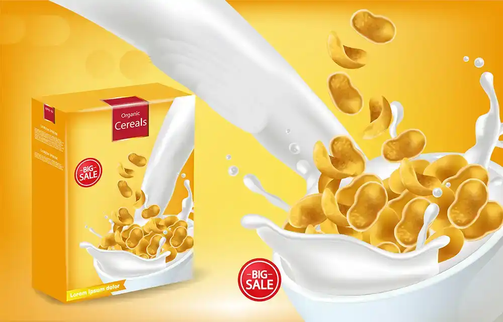
🎯 Hook: Your child isn’t just picking cereal — their brain is picking the box.
We’ve all been there:
Standing in the cereal aisle, while your kid grabs the loudest, brightest, cartoon-filled box they can find — even if it’s not what you came for.
But why do kids fall in love with certain cereal boxes before they even know what it tastes like?
The answer lies in packaging psychology — a clever mix of color science, character placement, and emotional design.
🎨 1. Bright Colors = Instant Attention
Children are naturally drawn to:
- 🔴 Red – excitement, energy, urgency
- 🟡 Yellow – happiness, fun, playfulness
- 🔵 Blue – comfort, safety, trust
- 🟣 Purple – imagination, magic, uniqueness
These colors are not random — they’re strategically chosen to grab attention and trigger curiosity.
🧠 In marketing psychology, bright colors are shown to increase product recall and preference in children under 12.
👀 2. Eye-Level Magic = Connection
Ever noticed that characters on cereal boxes make eye contact with kids?
- Mascots are positioned to look downward (toward a child’s eye level)
- This creates a sense of trust and attention, like the character is “talking” to them
💡 Studies show that direct gaze in packaging design increases likelihood of product choice — especially among young consumers.
🧸 3. Familiar Characters = Emotional Shortcut
Whether it’s a bear, tiger, or superhero — characters on cereal boxes create:
- 🧸 Familiarity
- 🧠 Faster recognition
- ❤️ Emotional bonding
Brands build mascots kids grow up with (like Tony the Tiger or Chocos Bear) — becoming part of their breakfast routine.
📦 It’s not just packaging — it’s storytelling.
🧩 4. Visual Simplicity = Easy Decision-Making
Kids don’t read ingredient lists. They react to:
- 🌀 Large icons and shapes
- 🎉 Fun fonts and bubbles
- 🍓 Fruit visuals and sprinkles
The simpler and more exaggerated the design, the easier it is for a child to say:
“That one!”
👪 5. What This Means for Parents & Teachers
| Insight | Why It Matters |
| 🌈 Color triggers emotion | Use this in learning materials too |
| 🧒 Kids choose with visuals | Don’t assume they’re reading details |
| 🧠 Design influences decisions | Packaging = parenting opportunity |
| 🧾 Balance branding + nutrition | Look for brands that blend both well |
Helping kids learn to read beyond the colors can be a fun educational moment in itself.
📦 How Brands (and Designers) Use This
Behind every cereal box is a thoughtfully crafted packaging plan — created by teams who specialize in:
- 🎯 Color psychology
- 🧩 Character placement
- 📊 Shelf impact testing
- 🧴 Package shape and size
💡 At PackagingSeller.com, we help brands (big and small) create fun, functional, and family-friendly packaging — especially for food, snacks, and kids’ products.
We make sure what’s inside matches the magic outside.
🧠 Final Thought
Cereal boxes aren’t just food packaging — they’re visual magnets that spark joy, curiosity, and brand loyalty.
So the next time your child reaches for the brightest box on the shelf, remember:
Their brain isn’t just hungry — it’s engaged.
Flexographic Printing for Packaging – When and Why to Use It


One Response