
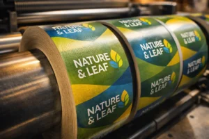
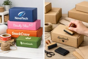
Chocolate packaging is more than just a wrapper—it plays a huge role in branding, storytelling, and customer experience. The best chocolate brands use packaging to create a luxurious, fun, or artisanal feel that attracts customers and enhances product value. Here’s a look at 10 successful chocolate brand packaging designs and what makes them stand out.
1. Ferrero Rocher – Elegance in Simplicity

🍫 Why It Works?
- Uses gold foil wrapping to symbolize luxury.
- Clear box packaging makes chocolates look premium.
- Ribbon and branding elements create a gift-ready experience.
✨ Lesson Learned: Elegant packaging can make chocolates feel more exclusive and high-end.
2. Godiva – Classic & Timeless Luxury

🍫 Why It Works?
- Uses rich colors like gold, black, and deep brown.
- Features embossed lettering for a premium touch.
- Elegant ribbon closures add a luxurious feel.
✨ Lesson Learned: High-end packaging with metallic accents creates a sophisticated brand image.
3. Lindt – Minimalist Yet Premium

🍫 Why It Works?
- Uses signature gold foil for brand recognition.
- Premium-looking matte and glossy finishes.
- Focuses on Swiss heritage with refined typography.
✨ Lesson Learned: Simple yet premium designs create trust and appeal to chocolate lovers.
4. Toblerone – Iconic Shape & Design

🍫 Why It Works?
- Triangular packaging makes it instantly recognizable.
- Features the Matterhorn mountain in branding for a strong identity.
- Smart design enhances stacking and display appeal.
✨ Lesson Learned: Unique structural design makes brands memorable and marketable.
5. Cadbury Dairy Milk – Vibrant & Friendly

🍫 Why It Works?
- Uses deep purple packaging, a signature since 1914.
- Features fun typography for a playful brand identity.
- Glossy finish enhances visual appeal on shelves.
✨ Lesson Learned: Consistent color branding builds strong consumer recognition.
6. Ghirardelli – Premium Craft Chocolate Look

🍫 Why It Works?
- Uses rich, dark colors for a gourmet feel.
- Elegant foil accents to highlight premium quality.
- Clearly displays cacao percentage for informed choices.
✨ Lesson Learned: Educating consumers through packaging helps create a premium perception.
7. Ritter Sport – Functional & Colorful

🍫 Why It Works?
- Square shape makes it unique and easy to carry.
- Color-coded packaging for different flavors.
- Uses resealable packaging for convenience.
✨ Lesson Learned: Functional, easy-to-use packaging enhances user experience and repeat purchases.
8. Mast Chocolate – Minimalist & Artisanal

🍫 Why It Works?
- Handmade-style packaging with a matte, textured finish.
- Uses earthy, natural tones to reflect craftsmanship.
- Minimalistic branding gives it a modern, boutique feel.
✨ Lesson Learned: Artisanal packaging appeals to handcrafted and organic product lovers.
9. Milka – Soft, Whimsical Appeal

🍫 Why It Works?
- Uses a pastel purple and white color scheme for a soft look.
- Features an Alpine cow mascot, making it friendly and nostalgic.
- Soft-touch finishes give a warm and comforting feel.
✨ Lesson Learned: Playful and nostalgic packaging makes products feel approachable and comforting.
10. Tony’s Chocolonely – Bold & Ethical

🍫 Why It Works?
- Bright, bold colors for strong shelf impact.
- Chunky, uneven chocolate pieces symbolize fair trade and justice.
- Informative packaging highlights ethical sourcing.
✨ Lesson Learned: Brand storytelling through packaging can drive a powerful social message.
Final Thoughts
Great chocolate packaging is a blend of design, branding, and functionality. Whether it’s luxury appeal, eco-friendliness, or playful branding, the best packaging designs create an emotional connection with consumers and drive sales.
Which chocolate brand’s packaging do you love the most? Let us know in the comments! 🍫✨
Innovative Packaging Ideas to Stand Out on Store Shelves


2 Responses