
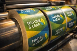
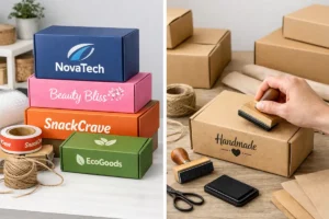
CMYK vs Pantone in Packaging Printing – In packaging design, color isn’t just decoration — it’s identity. From Coca-Cola red to Cadbury purple, consistent color builds instant recognition and trust. But if you’re working with printers, you’ve likely heard of CMYK and Pantone — two very different color systems that can make or break your packaging.
Let’s explore what they are, how they differ, and how to choose the right one for your packaging needs.
🧠 What Is CMYK?
CMYK stands for Cyan, Magenta, Yellow, and Key (Black) — the four basic ink colors used in most digital and offset printing.
It works through color blending:
- Different percentages of these inks are layered to create other colors
- Suitable for full-color printing like photos, gradients, and multi-colored designs
✅ Best for:
- Labels and packaging with lots of images
- Affordable printing on digital presses
- Short runs and prototypes
🎨 What Is Pantone?
Pantone (PMS) is a standardized color matching system with over 1,000+ pre-mixed colors. Each color has a unique code (like Pantone 185 C), ensuring exact color replication across different printers, countries, and substrates.
Unlike CMYK, Pantone uses solid spot inks, not blends.
✅ Best for:
- Logos, icons, and brand color blocks
- When exact color consistency is critical
- High-end and luxury packaging
🆚 CMYK vs Pantone – What’s the Difference?
| Feature | CMYK | Pantone (PMS) |
| Color Creation | Mixing 4 inks | Pre-mixed solid inks |
| Consistency | May vary slightly across printers | Exact match every time |
| Color Range | Wide but not as vibrant as Pantone | Richer, more vibrant, includes metallics |
| Best Use Case | Photographic prints, full-color designs | Brand colors, logos, premium packaging |
| Print Cost | Lower for full color jobs | Higher due to custom ink usage |
| Setup Time | Faster (digital) | Slower, often used in offset printing |
🎯 Why Color Matching Matters in Packaging
Imagine your lip balm packaging turns out purple-blue instead of lavender, or your chocolate brand’s brown varies across batches. That’s a brand killer.
Inconsistent colors lead to:
- Loss of trust
- Brand dilution
- Poor shelf presence
- Increased returns or reprints
This is why brands lock in Pantone colors for their logos and primary elements, ensuring consistency from box to pouch to label.
🔄 Can You Convert Pantone to CMYK?
Yes — but with limitations.
While most Pantone colors can be converted to CMYK equivalents, the result may:
- Look duller or different, especially in reds, neons, or metallics
- Vary across paper types (glossy vs matte)
💡 Pro tip: Always do a physical print test before final approval.
🧪 Real-Life Example
Cadbury’s iconic purple (Pantone 2685 C) is so important to their brand, they trademarked it. If they used CMYK, the shade could shift across batches — which would damage their brand equity.
✅ Which One Should You Use?
| If you’re a… | Go with… | Why? |
| Startup testing packaging | CMYK | Cost-effective, flexible for small runs |
| Premium or export brand | Pantone | Unmatched color control and consistency |
| Running full-color prints | CMYK | Best for photos, gradients, complex graphics |
| Printing logo-heavy labels | Pantone + CMYK | Use Pantone for logos, CMYK for background |
📦 At PackagingSeller.com, We Help You:
- Choose the right color system for your budget & quality goals
- Convert Pantone codes into CMYK-safe designs
- Deliver print-ready files for both digital & offset printing
- Maintain consistent branding across all packaging types
📌 Final Thoughts
Understanding the difference between CMYK and Pantone can save you money, time, and brand credibility. For short runs or image-heavy packaging, CMYK is great. For high-end, consistent branding, Pantone is a must.
Choose wisely, and let color become your silent brand ambassador.
Best Indian Mobile Phone Companies – Top 10 Made in India Smartphone Brands


One Response