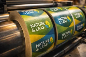
Designing food packaging isn’t just about looking good — it’s about function, compliance, trust, and sales.
Yet, many startups and even established brands fall into common packaging traps that can cost them shelf space, reputation, and customers.
Let’s break down the top 5 food packaging design mistakes — with real-world examples — and how PackagingSeller.com helps you avoid them.
1. ❌ Ignoring Readability and Hierarchy
Why it matters:
If your packaging can’t be read from a distance — or in a split second — customers won’t bother.
- Font too small?
- Product name not standing out?
- Colors clashing with text?
Real Example:
A gourmet granola brand used a cursive font over a textured kraft background. While it looked “artsy,” customers couldn’t read the product name on shelves — leading to poor sales.
Fix:
✅ Prioritize clear fonts
✅ Highlight product name, flavor, and key benefits
✅ Use contrast and layout wisely
🔧 PackagingSeller templates ensure clarity with well-structured type hierarchy.
2. ❌ Overcomplicating the Design
Why it matters:
Too many elements confuse buyers. In packaging, less is often more.
- Loud backgrounds
- Competing graphics
- Overstuffed content
Real Example:
A startup snack brand added icons, awards, nutrition, a story, and QR codes — all in the front panel. The clutter overwhelmed customers.
Fix:
✅ Use clean layout grids
✅ Leave breathing space
✅ Focus on one message at a time
🔧 Our editable templates are minimalist and conversion-focused.
3. ❌ Not Following Labeling Regulations
Why it matters:
Incorrect or missing FSSAI numbers, expiry details, or allergen info can lead to fines or product recalls.
- No batch or MRP?
- Nutritional table missing?
- Misleading health claims?
Real Example:
A protein bar brand got delisted from Amazon because it didn’t mention “contains soy” on the back label.
Fix:
✅ Always include regulatory must-haves
✅ Use trusted design checklists
✅ Cross-check FSSAI, FDA, or EU labeling norms (based on where you sell)
🔧 PackagingSeller offers regulation-ready templates and compliance check support.
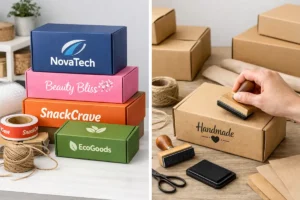
4. ❌ Using Inconsistent Branding
Why it matters:
Every SKU must look part of the same family — else customers won’t remember you.
- Different logo placements?
- Changing color palettes or font styles?
Real Example:
A fruit juice company used different fonts for each flavor — making it look like different brands instead of one cohesive product line.
Fix:
✅ Lock brand rules: logo, font, layout grid
✅ Apply consistent tone across packaging
✅ Ensure scalability for multiple SKUs
🔧 We help create brand-aligned templates that scale with your product range.
5. ❌ Choosing the Wrong Packaging Type
Why it matters:
Looks aren’t everything. Your packaging must fit the product and use case.
- Wet products in paper pouches?
- Too large or bulky boxes?
- Not heat-sealed?
Real Example:
A new spice brand packed powders in thin zip pouches — which leaked and didn’t reseal properly. It led to negative reviews and returned orders.
Fix:
✅ Match material to product type (liquid, dry, fragile)
✅ Consider shipping and shelf life
✅ Test physical samples before bulk print
🔧 PackagingSeller guides you to the right formats — sleeves, pouches, boxes, or jars.
🎯 Final Thoughts
Food packaging is not just design — it’s a strategy. The smallest mistake can cost you customers. But the right design, format, and message can make your product fly off the shelf.
Whether you’re a snack startup or a beverage D2C brand — get it right from the start with help from PackagingSeller.com.
✨ What We Offer to Fix These Mistakes
✅ 300+ editable food packaging templates
✅ Custom pouch, box, sleeve & label design
✅ Print-ready + regulation-compliant formats
✅ Free design consultations for food & beverage startups
Let us help you build packaging that sells and scales.