
🎯 Hook: Because even your shampoo bottle is part of your mental wellness routine.
You’re not imagining it — some products just feel better.
Not just because of what’s inside, but because of how they’re wrapped, how they open, how they feel in your hand.
That feeling of calm when unboxing a candle.
The joy from a pastel-toned skincare pouch.
The comfort of a recycled paper label with handwritten fonts.
It’s not accidental — it’s packaging psychology at work.
And it’s silently shaping your mood.
🧠 Your Brain Responds to Packaging Before You Even Know It
Our minds process visual and tactile cues faster than logic.
Before you read the label, your brain is already forming an opinion:
- Is this safe?
- Is this luxurious?
- Does this make me feel good?
Within 0.1 seconds, a package can trigger emotions like trust, calm, excitement, or even anxiety.
In the world of self-care and wellness, packaging becomes part of the ritual.
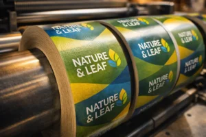
🌿 The Color Code of Calm
Color has a deep emotional impact on our mood.
| Color | Emotional Response | Common in Products Like… |
| 🌿 Soft Green | Healing, natural, balanced | Herbal skincare, clean food, supplements |
| 💧 Pale Blue | Calm, cool, peaceful | Sleep aids, bath salts, face mists |
| 🌸 Blush Pink | Compassion, softness, comfort | Body lotions, masks, beauty kits |
| ☀️ Warm Yellow | Cheer, energy, optimism | Journals, teas, vitamin packaging |
| 🖤 Deep Charcoal | Strength, elegance, security | Perfumes, anti-aging creams, oils |
These choices aren’t random — they’re rooted in emotional design.
✨ Texture Tells a Story
The feel of packaging can influence how safe or special a product feels:
- 🧴 Matte finishes: Calm, minimal, modern
- 📦 Textured paper or natural kraft: Earthy, grounded, authentic
- 🧊 Glossy finishes: Energetic, bold, premium
- 🌱 Glass containers: Pure, sustainable, clean
Touch isn’t just physical — it’s emotional memory.
And that’s why thoughtful textures help you feel more connected to the product.
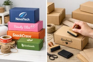
📦 Minimal vs. Cluttered: Less is Truly More
In a chaotic world, minimal packaging design can signal:
- Clarity
- Cleanliness
- Calm
- Focus
Busy designs with too many fonts or colors may trigger subconscious mental clutter — the exact opposite of what wellness should feel like.
That’s why premium self-care brands often use:
✅ White space
✅ Simple typography
✅ Clean labeling
✅ Gentle iconography
It’s not about luxury — it’s about mental breathing room.
🎁 Unboxing as a Mood Ritual
Ever opened a product that felt too beautiful to throw away?
That’s because:
- The scent was soothing
- The folds were intentional
- The colors felt calming
- There was a message or mantra inside
Unboxing becomes a wellness ritual — not just an interaction.
📥 It turns your purchase into presence.
🌸 Packaging as Part of Self-Care
Think about the last time you:
- Chose between two similar products — and picked the one that felt better
- Reused a box because it looked “too nice”
- Posted your product on Instagram because of the packaging
That’s how mood, mindfulness, and marketing overlap.
💡 Self-care is not just the product you use, but the experience it creates.
✍️ Final Thought
Packaging may seem like just “the outside.”
But it’s actually the first step of how a product cares for you.
Because before the serum soothes your skin,
the bottle soothed your mind.


3 Responses